I’ve been remaking my old app, QuickUnits, and have enjoyed the direction the design is going. While I’m not quite ready to publish the new version, I would like to show the direction the app has been going. I’ve made all new custom icons and completely re-written the app in Swift. The old app was in JavaScript, HTML, CSS, and wrapped in Cordova.
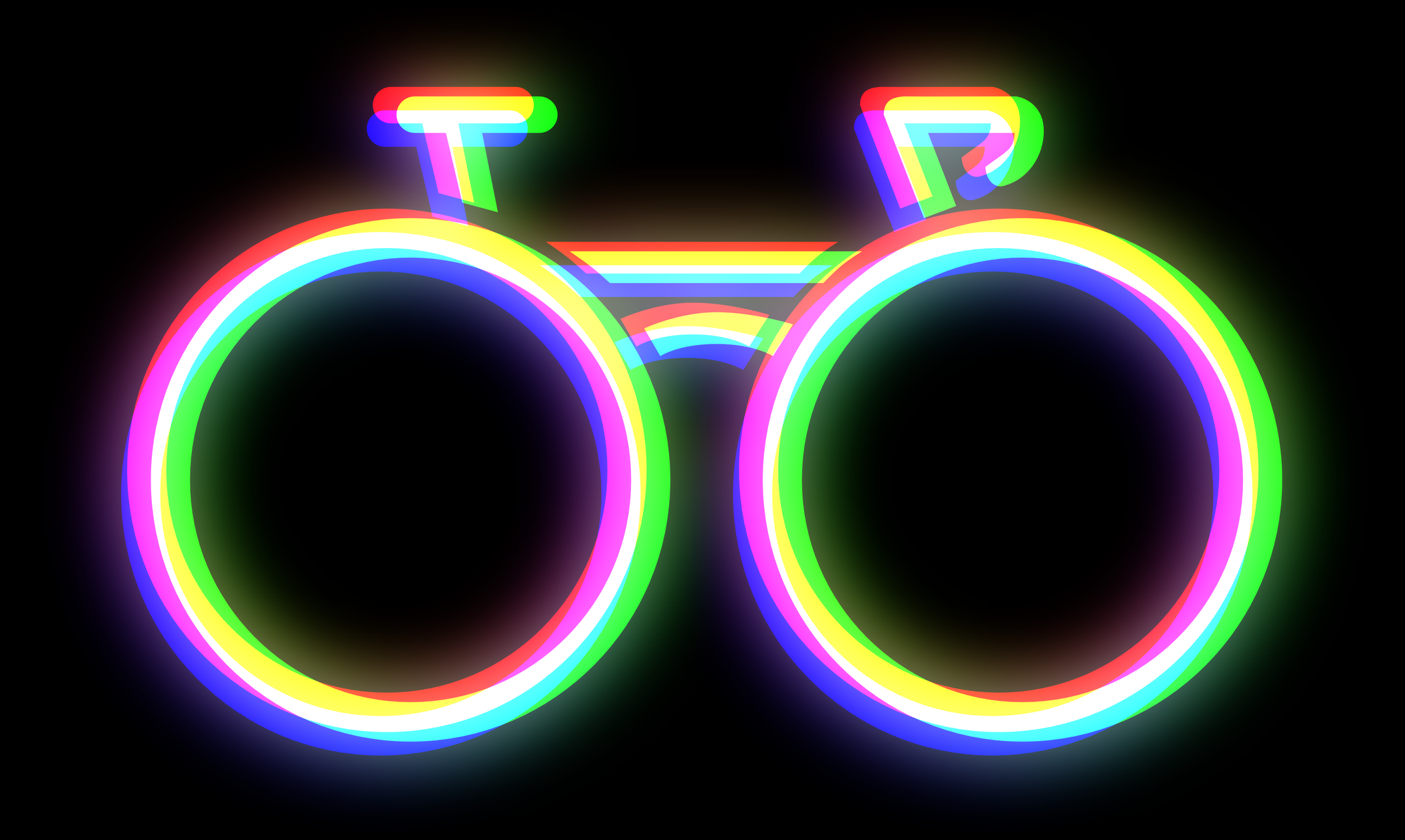
Let’s start with the icon. I used the same icon from 2013 to 2019 (when I removed the app from the store). I still like the original, but I always thought the “x:y” could be a little confusing since it’s not in the name of the app anywhere. For the new one, I took the new length icon, turned it 45° and inverted it. It’s meant to look a little bit like a “Q” (circle with diagonal line), and also be a more obvious reference to the internals of the app.

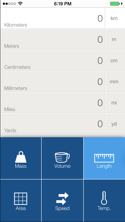
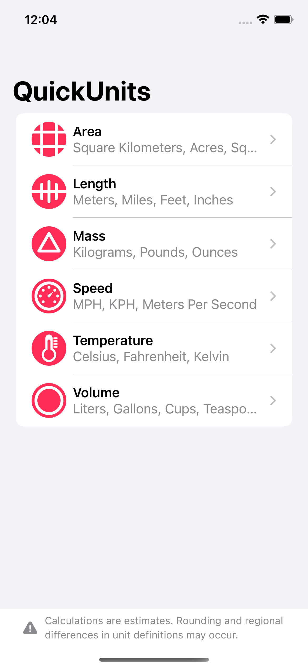
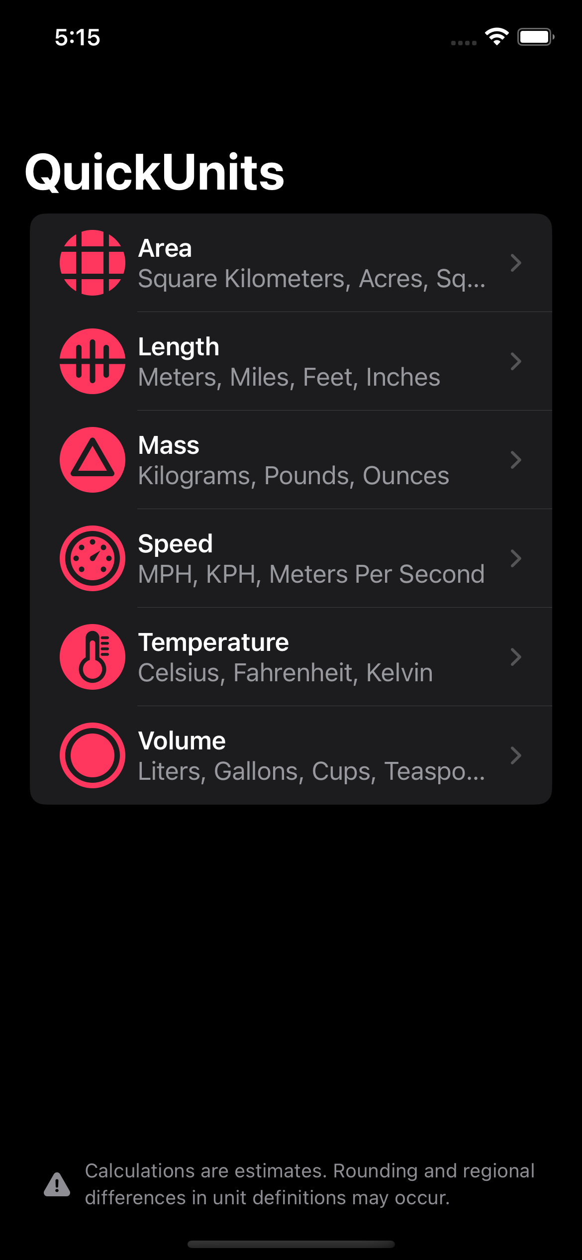
Next, the menu. While I liked the simplicity of the old menu that overlaid the keypad, it didn’t leave much room for expansion, and also doesn’t follow the conventions that most people are familiar with on the iPhone. The 2017 version was largely the same, but with some cleanup to match the modern iOS aesthetic. The new menu splits the app into a more familiar iPhone app layout and allows for endless expansion as well as light and dark modes. I’ve also completely redesigned all the unit icons. They’re made with strong inspiration from Apple’s SF Symbols to try and stay true to the iOS look.
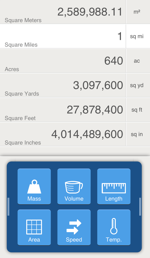
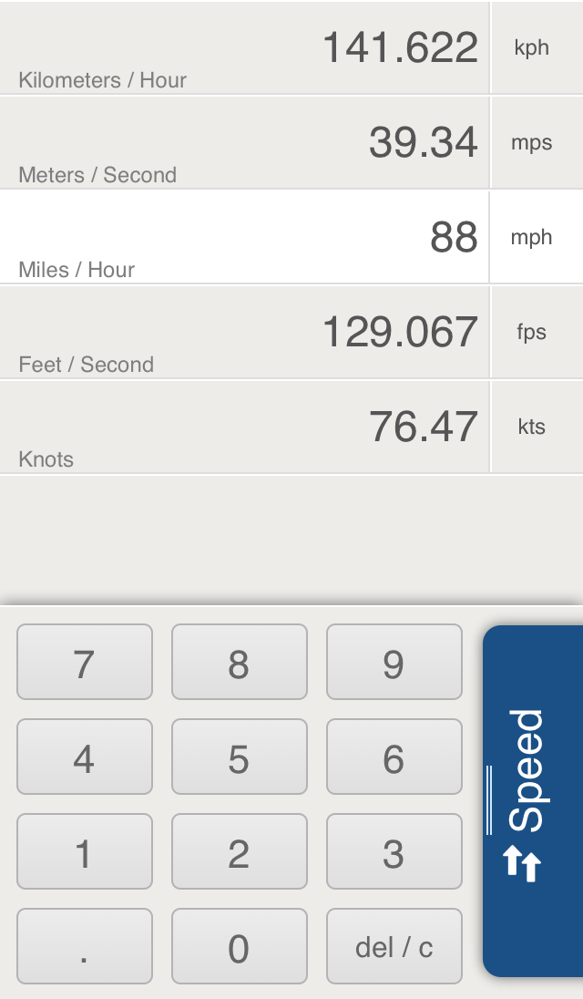
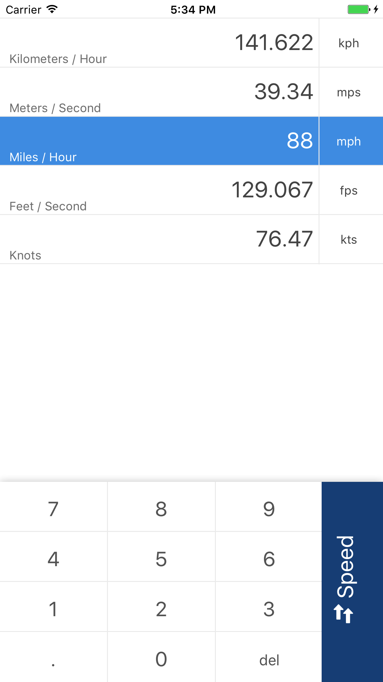
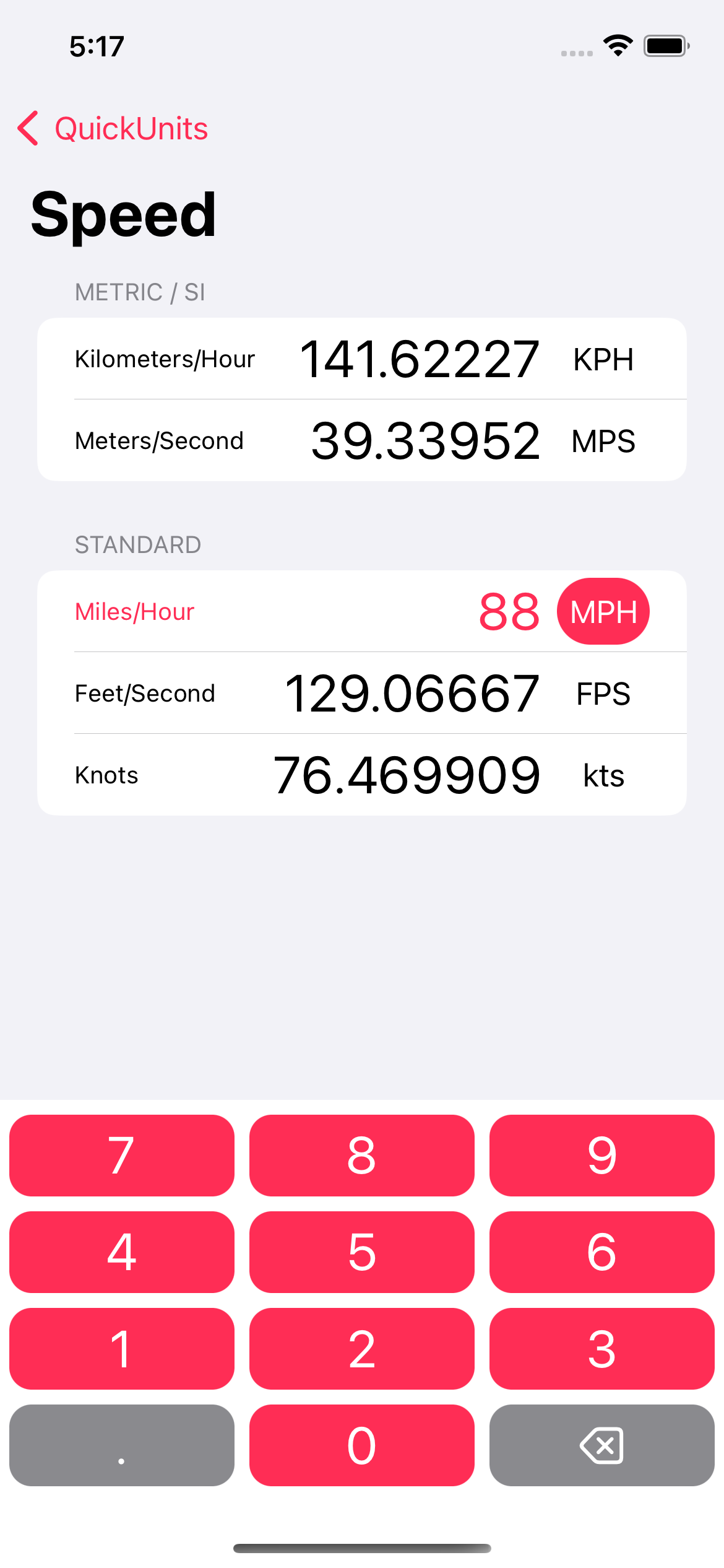
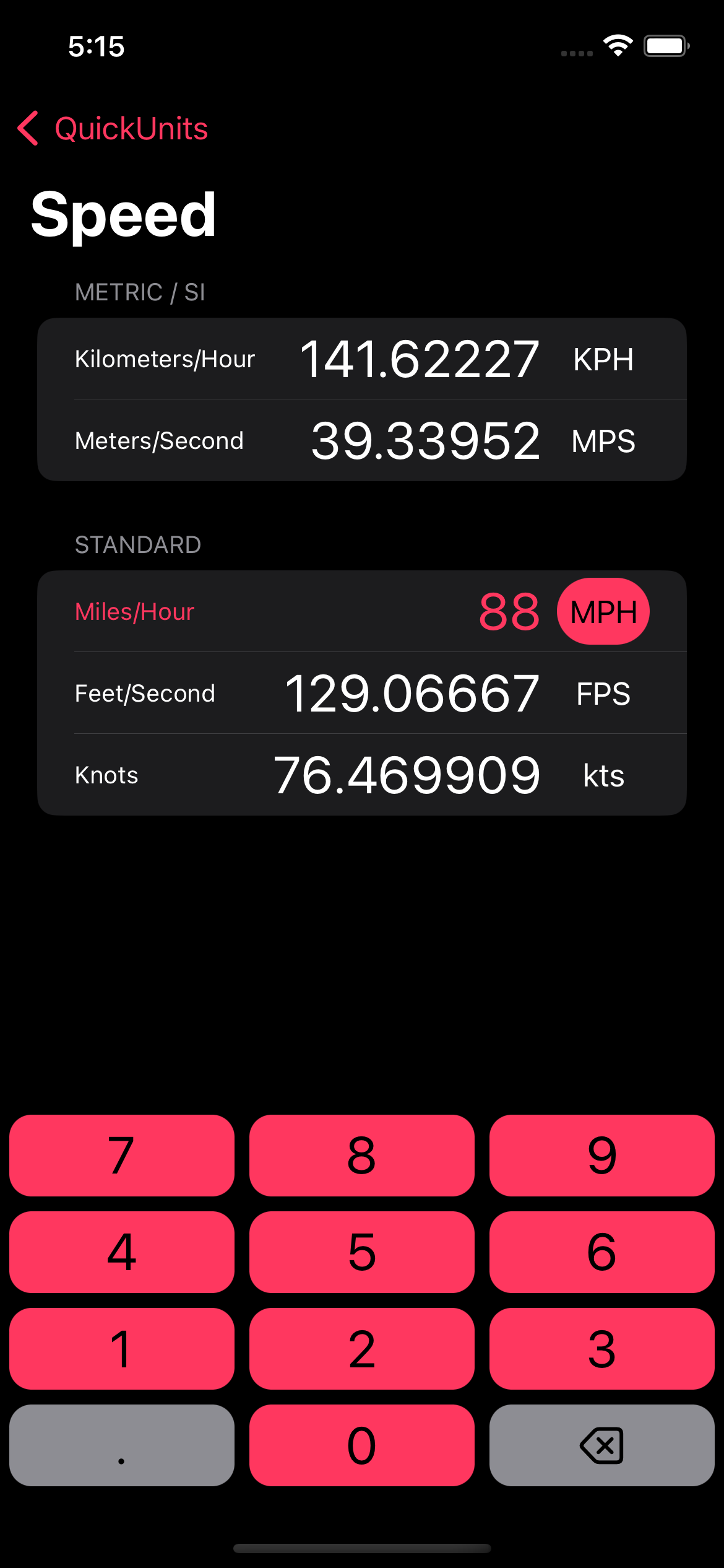
The unit view takes the same cues as the menu. I’ve changed the highlight on the selected unit and added category separation to make it easier to find the units you’re looking for. Here’s a view of the speed converter with the only measurement that really matters already filled in.
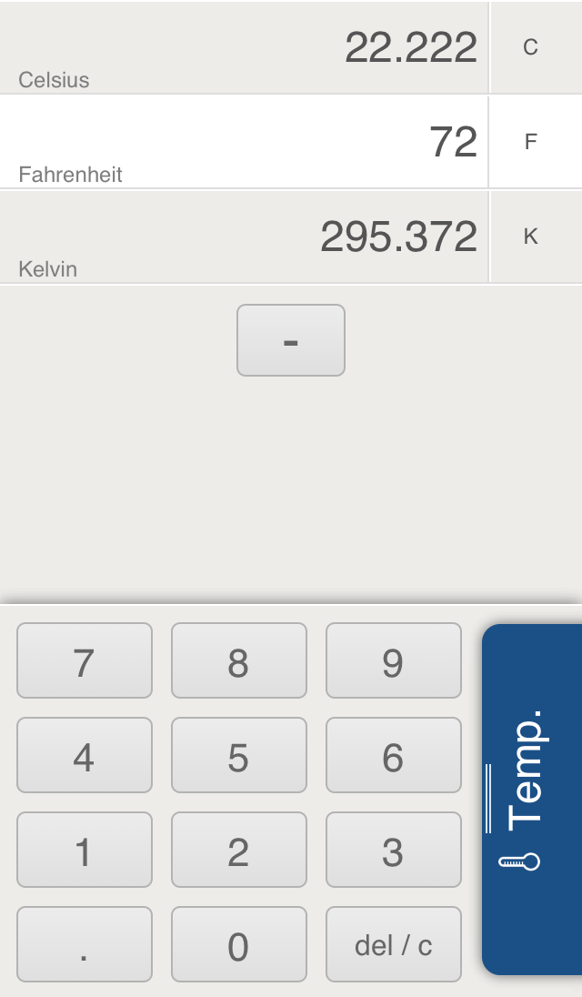
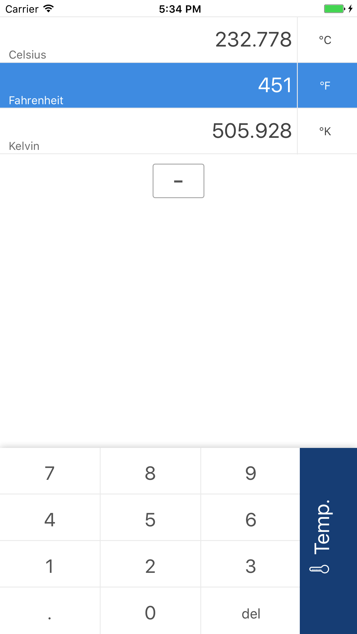
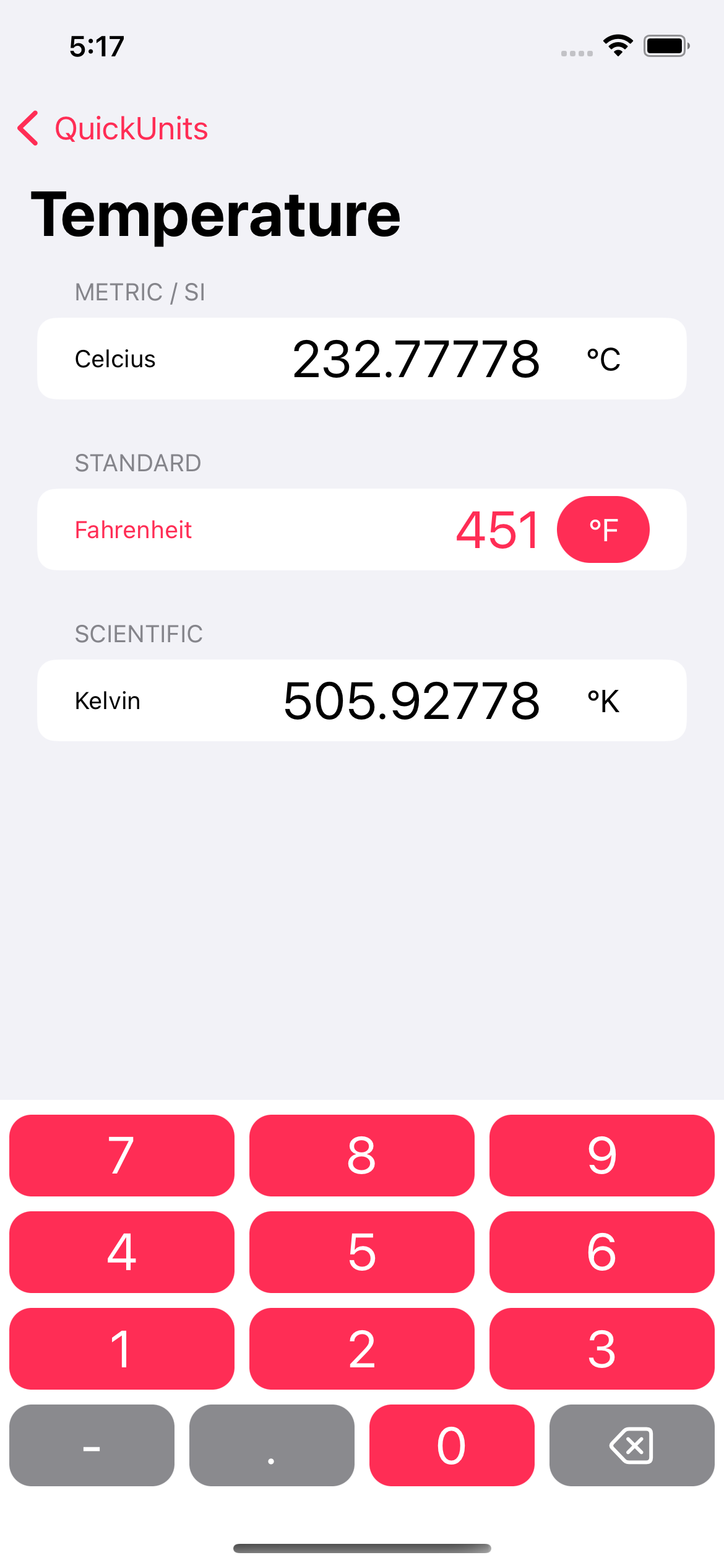
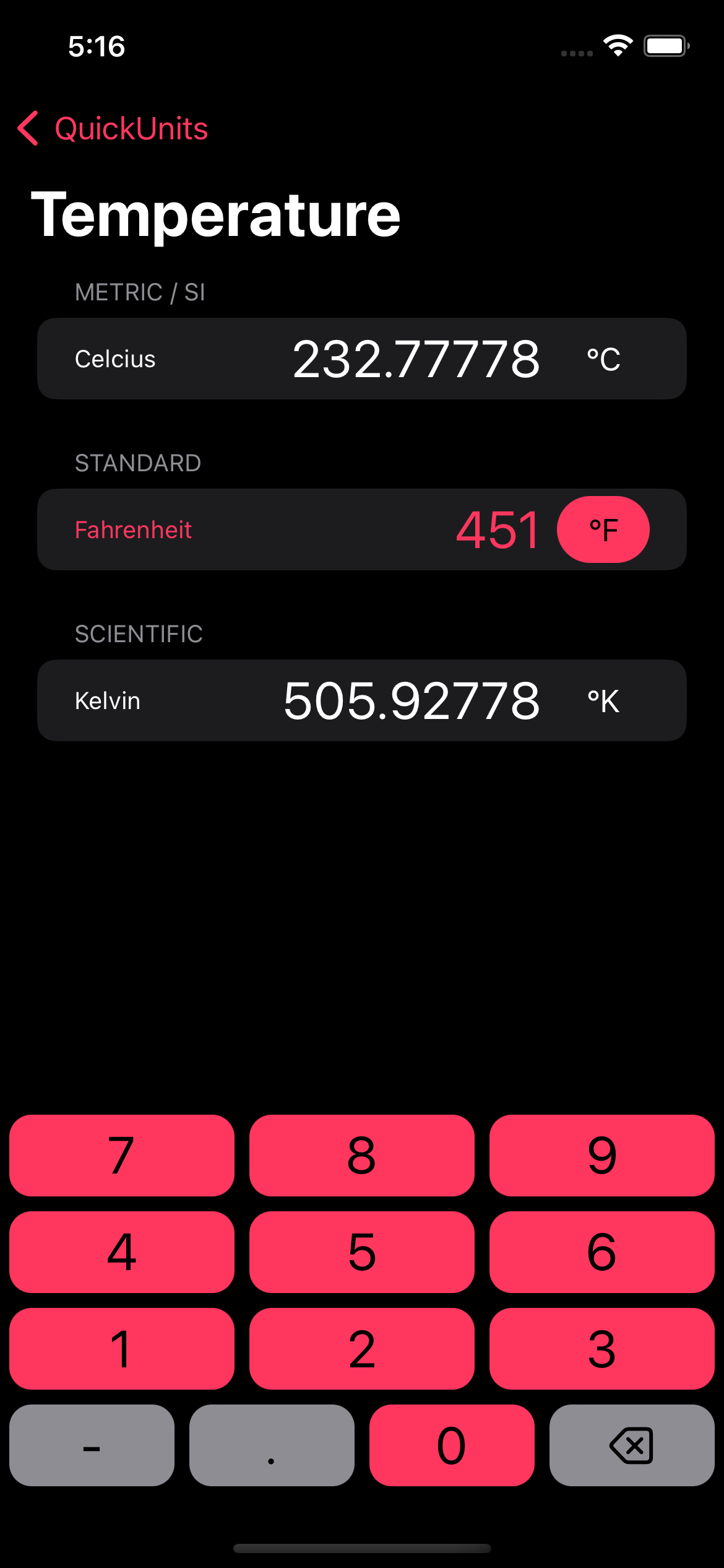
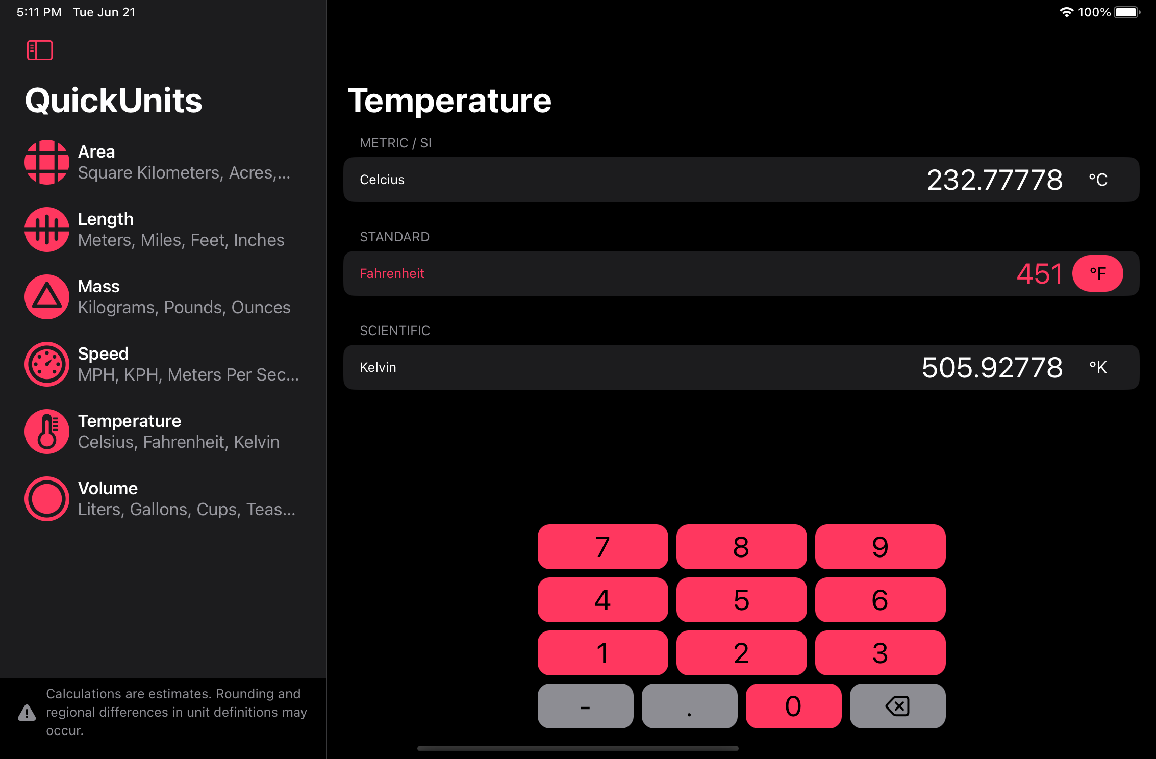
The older version of QuickUnits had what I could only describe as an “ugly hack” when it came to negative numbers. In order to enter a negative temperature, I put a minus button in the middle of the converter view. There’s no excuse, that was laziness. In order to correct this egregious design flaw, I’ve now made the keypad modular. If a negative button is needed for a given category, the category calls for it in the code and it appears in the bottom row, where it belongs. The other buttons in the bottom row seamlessly resize to fill the space. Throw in the new color and return to rounded rectangles (the way buttons are meant to be) and we’ve got a nice design overall.
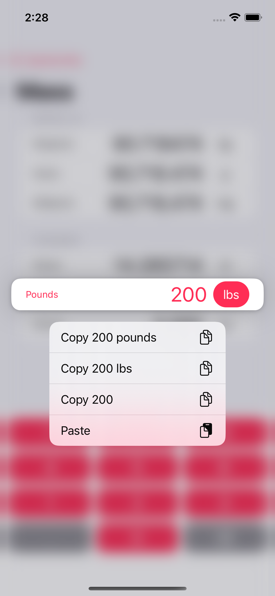
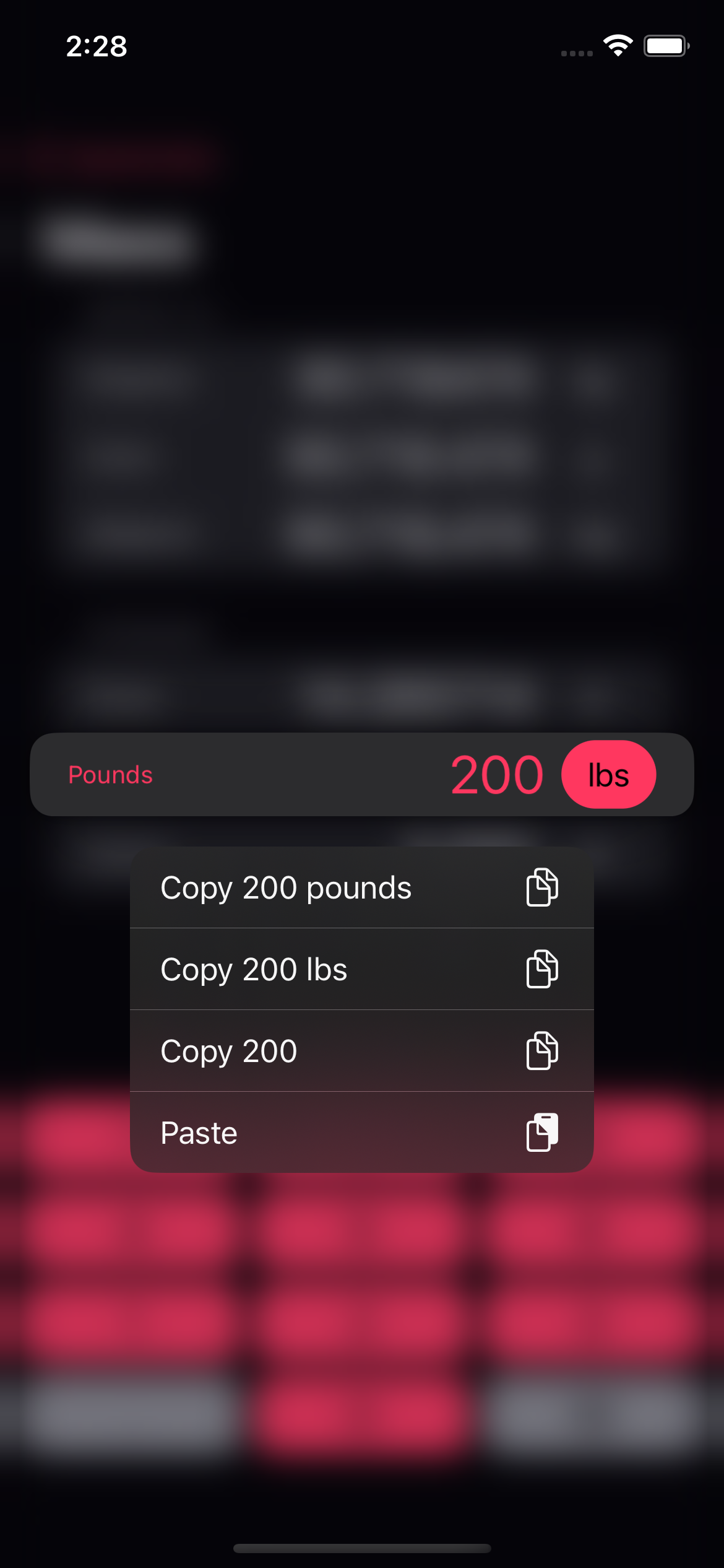
Now for an all new feature – copy and paste. Simply hold down on the the selected menu and various options to copy and paste from the clipboard. We even have different versions for copying out to allow you to match the format of where you’ll be pasting it later. This is something I always meant to do in the old versions, but never got around to.
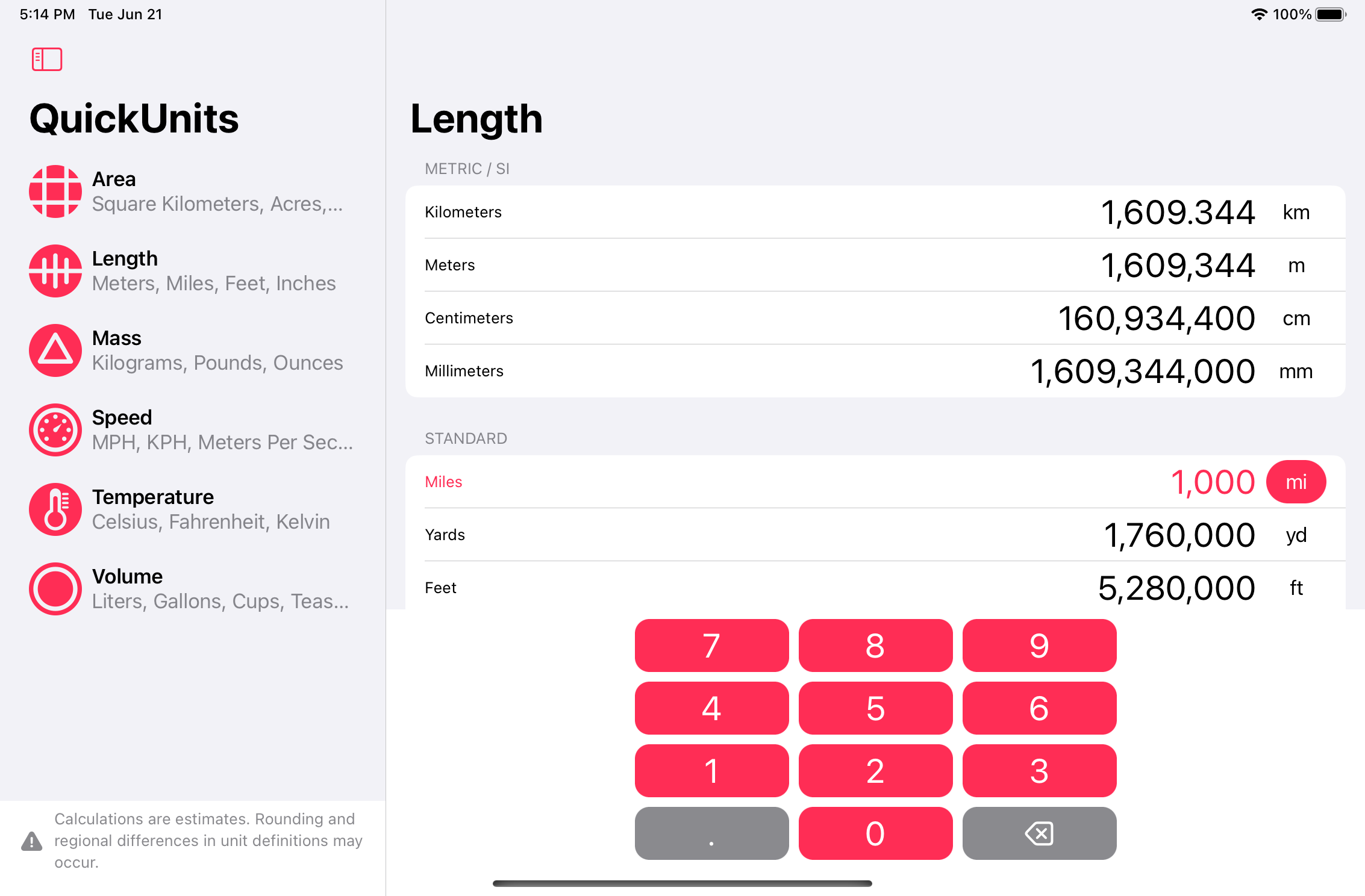
And finally, a sneak peek into the iPad design. With a larger screen there’s no need to swipe back to show the menu, it’s all on the screen all the time. I’m currently battling a bug or two with the iPadOS 16 beta, but I’m sure we’ll have it smoothed over soon enough.
That’s all for now. I’m planning to release the new version of the app when iOS/iPadOS 16 comes out in the fall and possibly for the Mac sometime after that. Stay tuned, I’ll post again when it’s live.