Tech


QuickUnits, Then and Now

I’ve been remaking my old app, QuickUnits, and have enjoyed the direction the design is going. While I’m not quite ready to publish the new version, I would like to show the direction the app has been going. I’ve made all new custom icons and completely re-written the app in Swift. The old app was in JavaScript, HTML, CSS, and wrapped in Cordova.

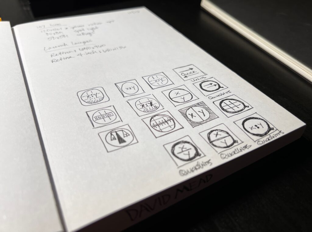
Let’s start with the icon. I used the same icon from 2013 to 2019 (when I removed the app from the store). I still like the original, but I always thought the “x:y” could be a little confusing since it’s not in the name of the app anywhere. For the new one, I took the new length icon, turned it 45° and inverted it. It’s meant to look a little bit like a “Q” (circle with diagonal line), and also be a more obvious reference to the internals of the app.

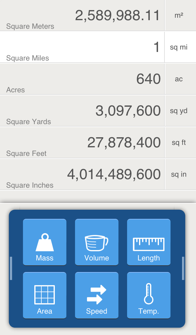
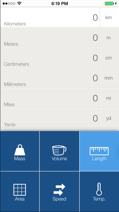
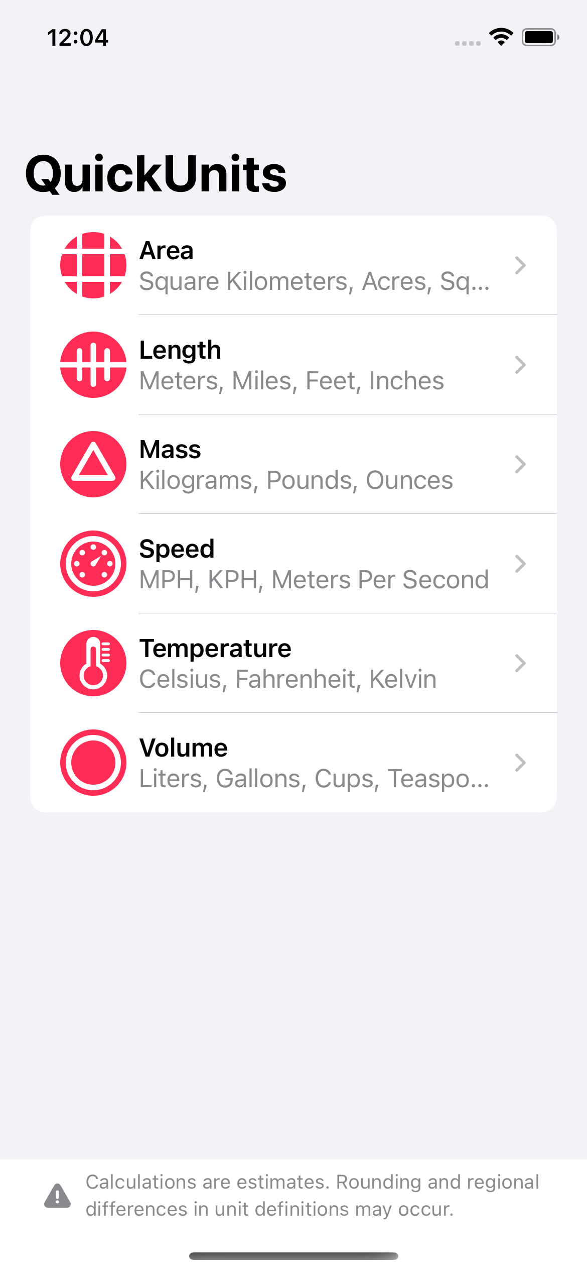
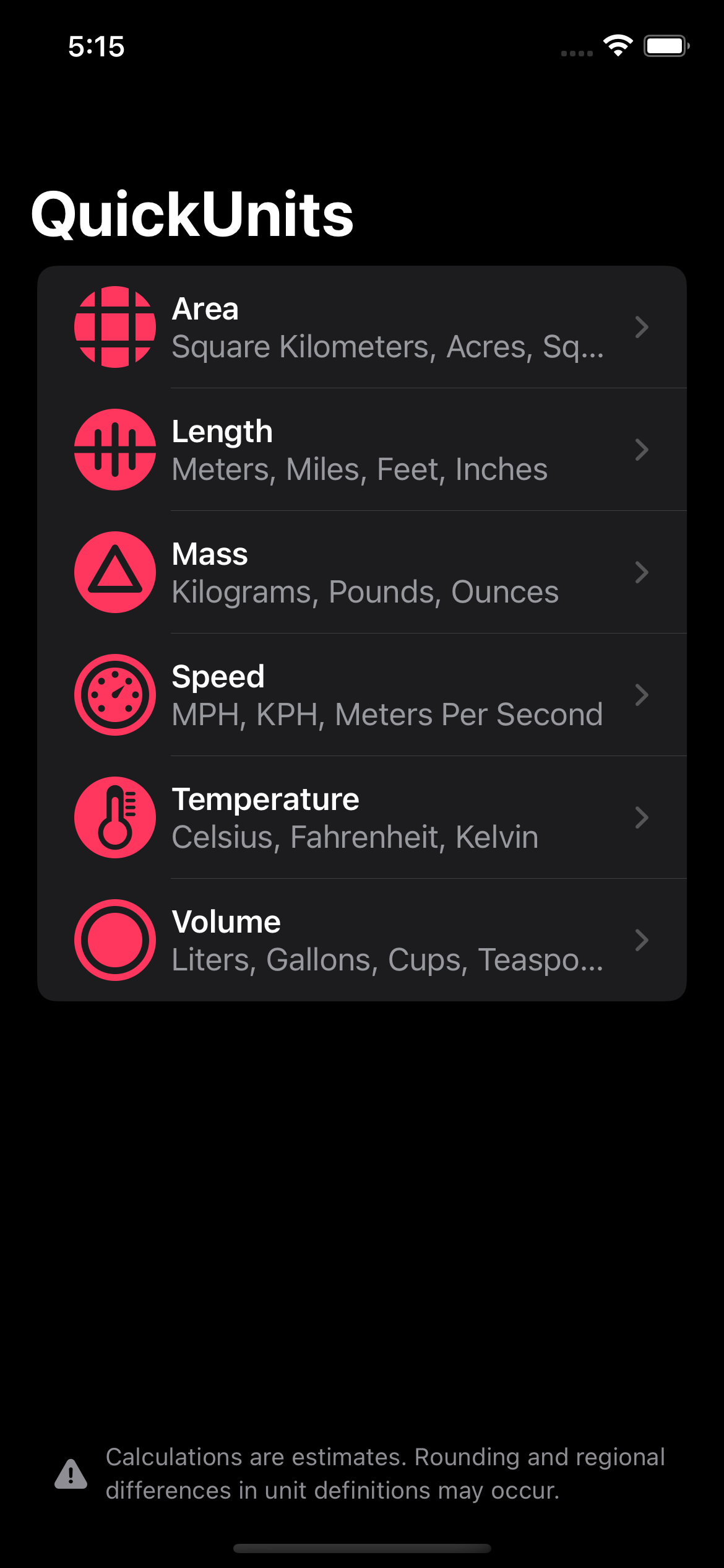
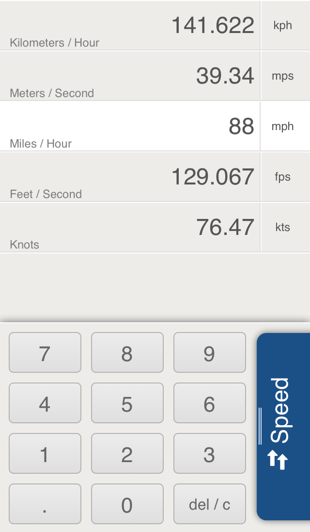
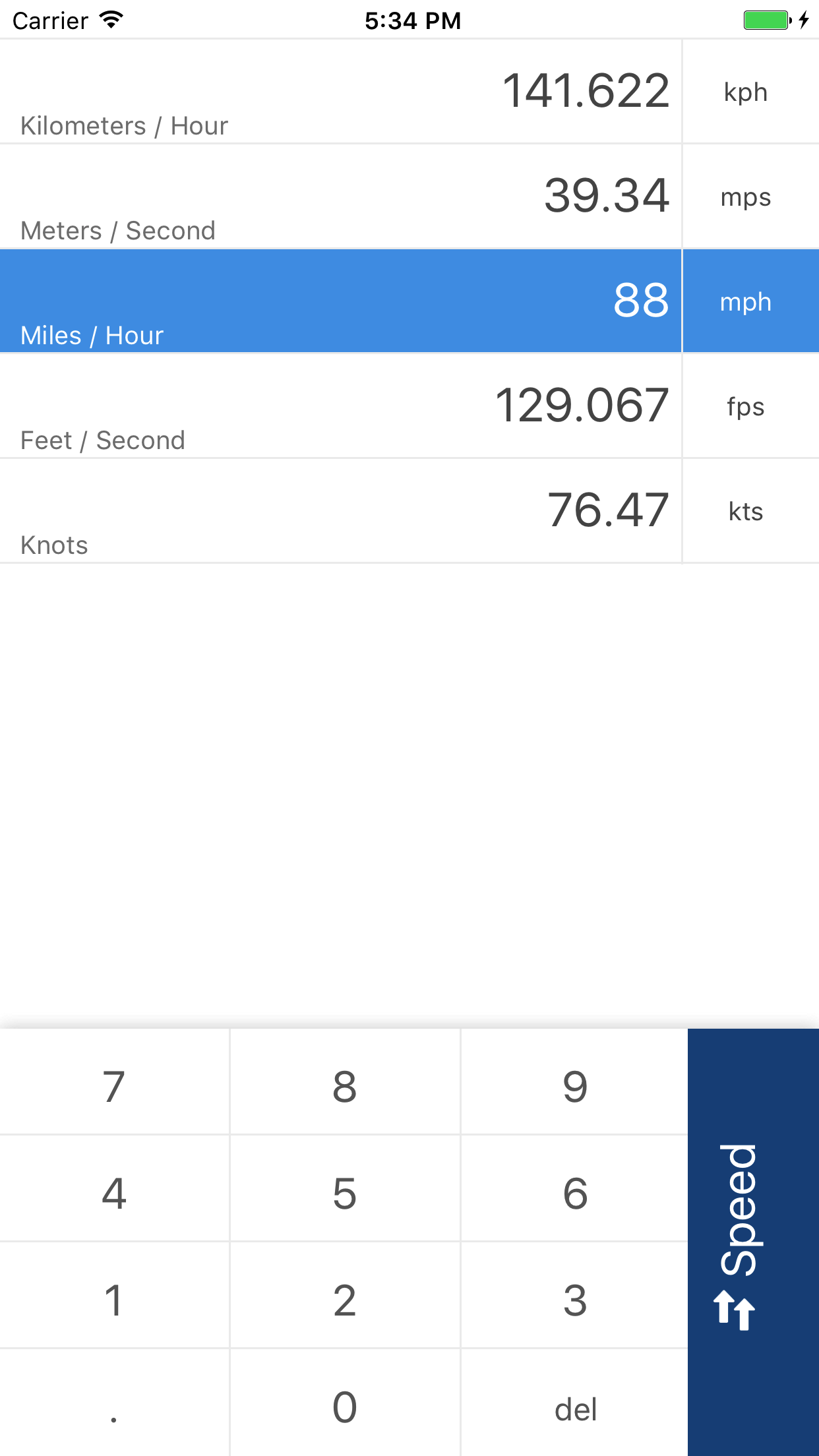
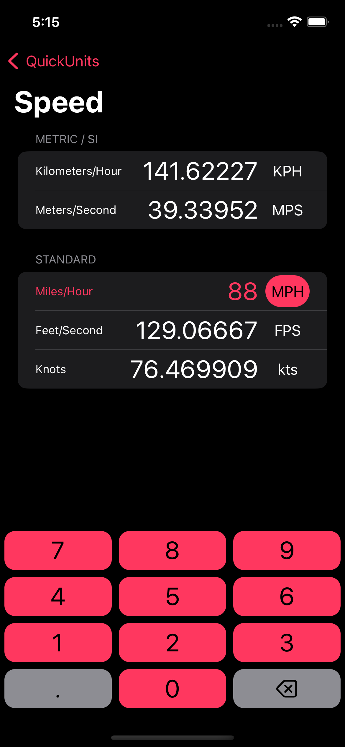
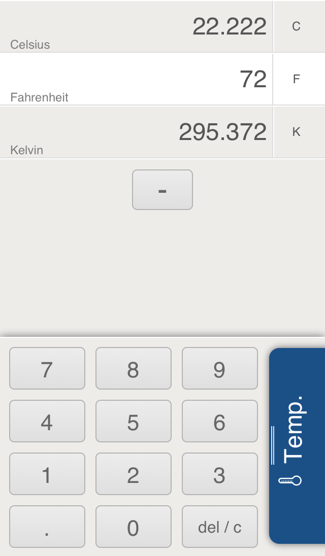
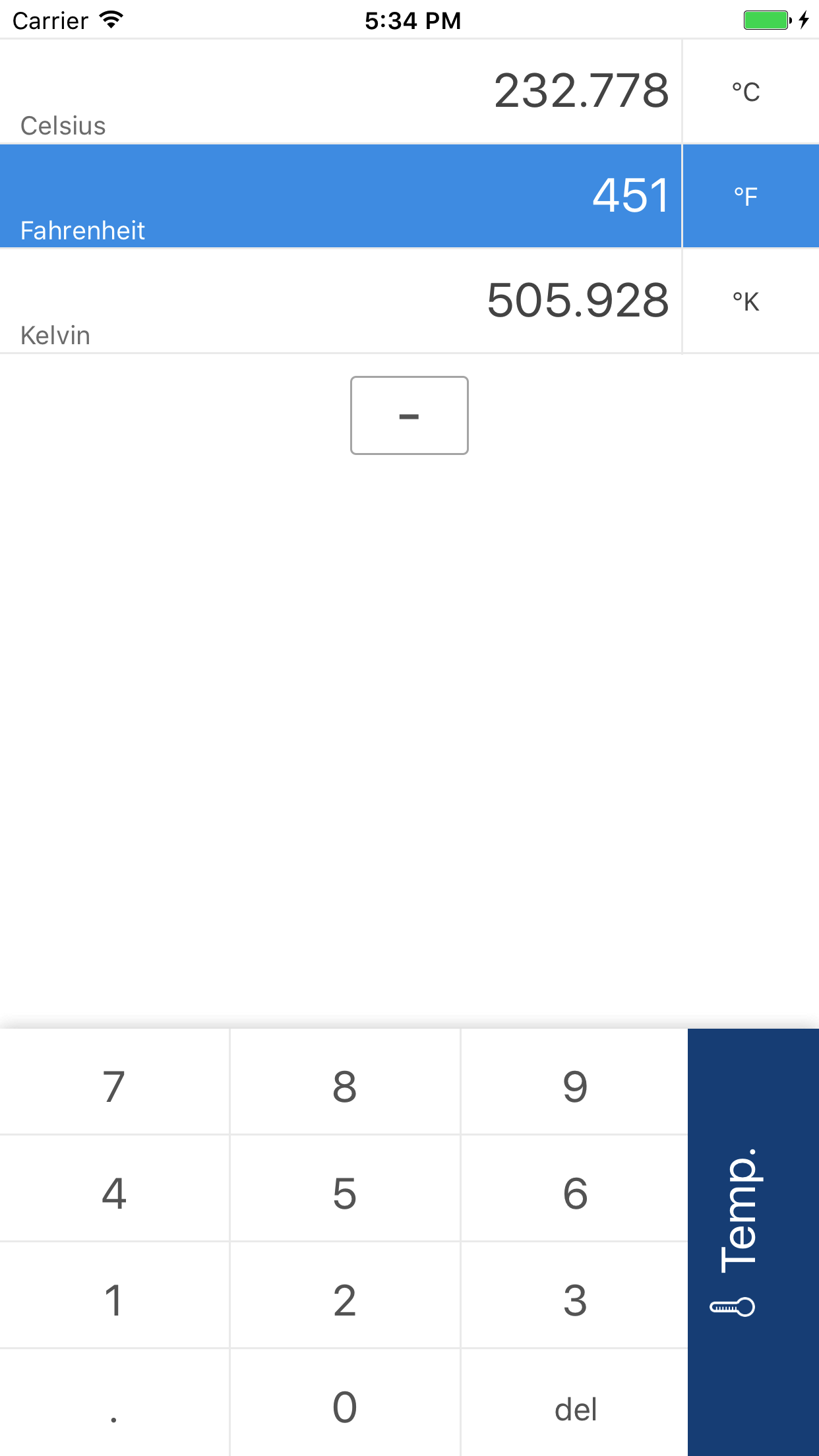
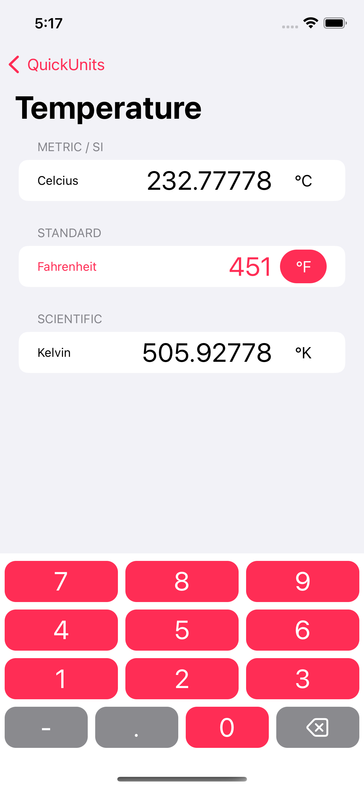
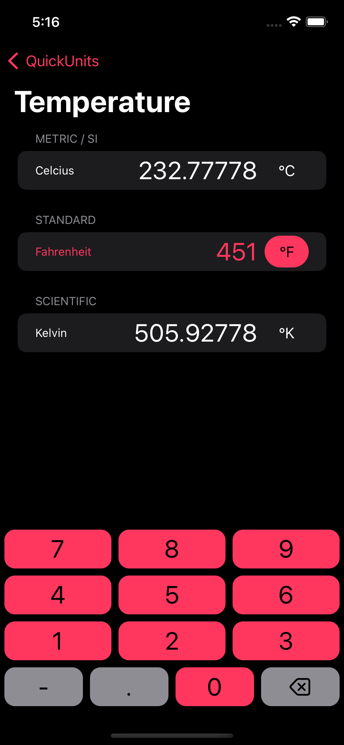
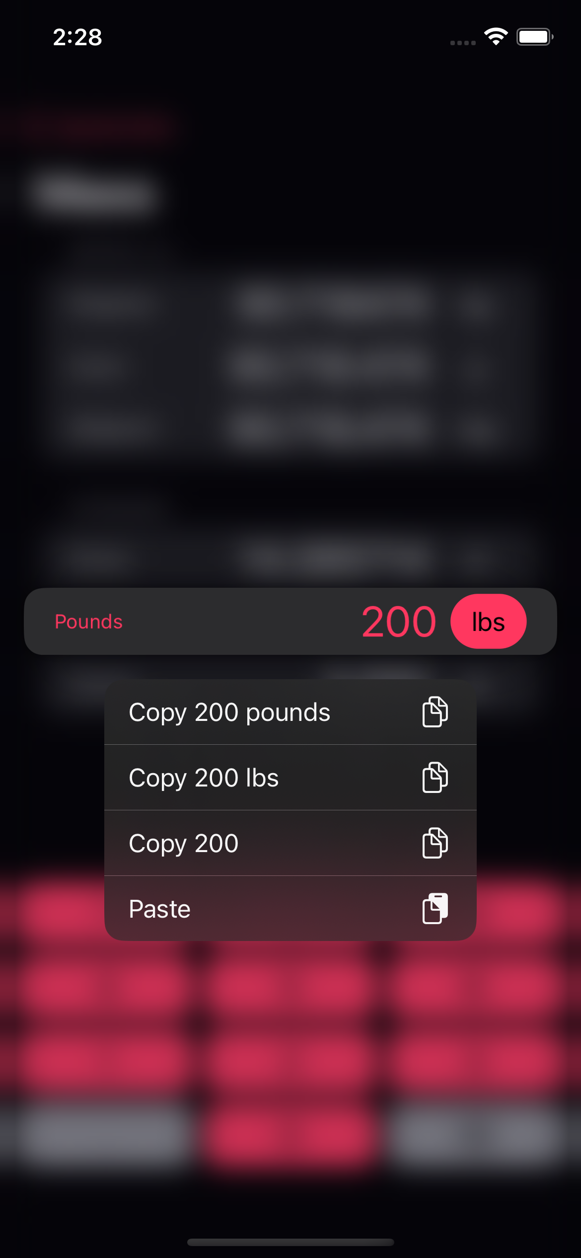
Next, the menu. While I liked the simplicity of the old menu that overlaid the keypad, it didn’t leave much room for expansion, and also doesn’t follow the conventions that most people are familiar with on the iPhone. The 2017 version was largely the same, but with some cleanup to match the modern iOS aesthetic. The new menu splits the app into a more familiar iPhone app layout and allows for endless expansion as well as light and dark modes. I’ve also completely redesigned all the unit icons. They’re made with strong inspiration from Apple’s SF Symbols to try and stay true to the iOS look.

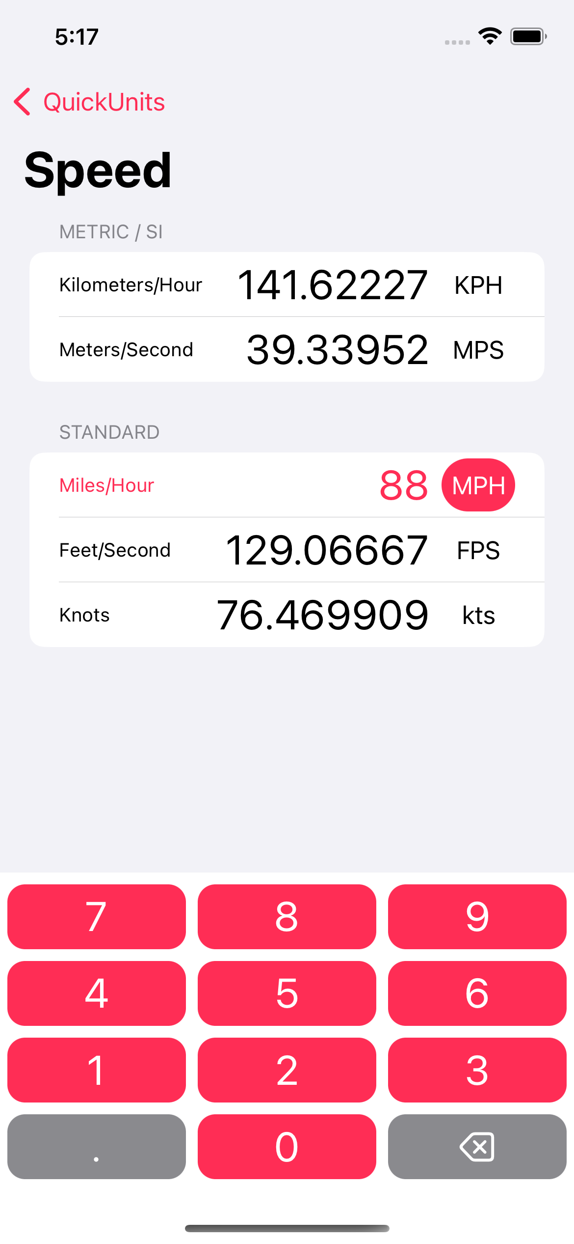
The unit view takes the same cues as the menu. I’ve changed the highlight on the selected unit and added category separation to make it easier to find the units you’re looking for. Here’s a view of the speed converter with the only measurement that really matters already filled in.

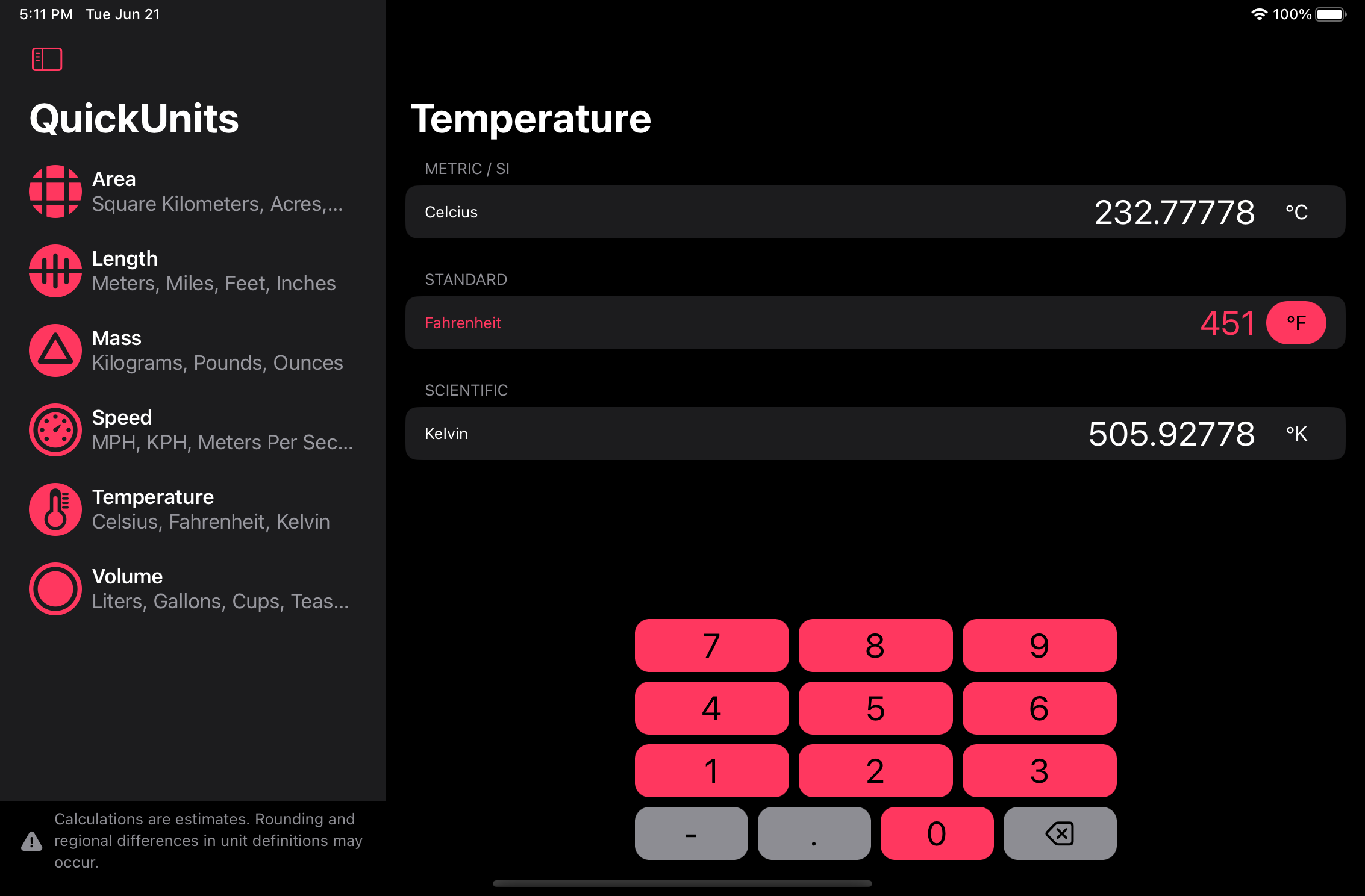
The older version of QuickUnits had what I could only describe as an “ugly hack” when it came to negative numbers. In order to enter a negative temperature, I put a minus button in the middle of the converter view. There’s no excuse, that was laziness. In order to correct this egregious design flaw, I’ve now made the keypad modular. If a negative button is needed for a given category, the category calls for it in the code and it appears in the bottom row, where it belongs. The other buttons in the bottom row seamlessly resize to fill the space. Throw in the new color and return to rounded rectangles (the way buttons are meant to be) and we’ve got a nice design overall.

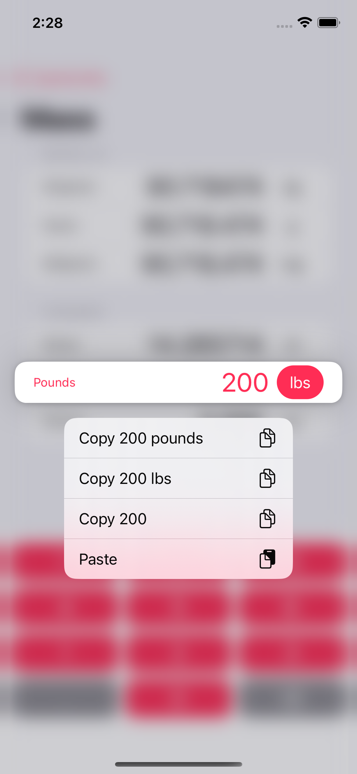
Now for an all new feature – copy and paste. Simply hold down on the the selected menu and various options to copy and paste from the clipboard. We even have different versions for copying out to allow you to match the format of where you’ll be pasting it later. This is something I always meant to do in the old versions, but never got around to.

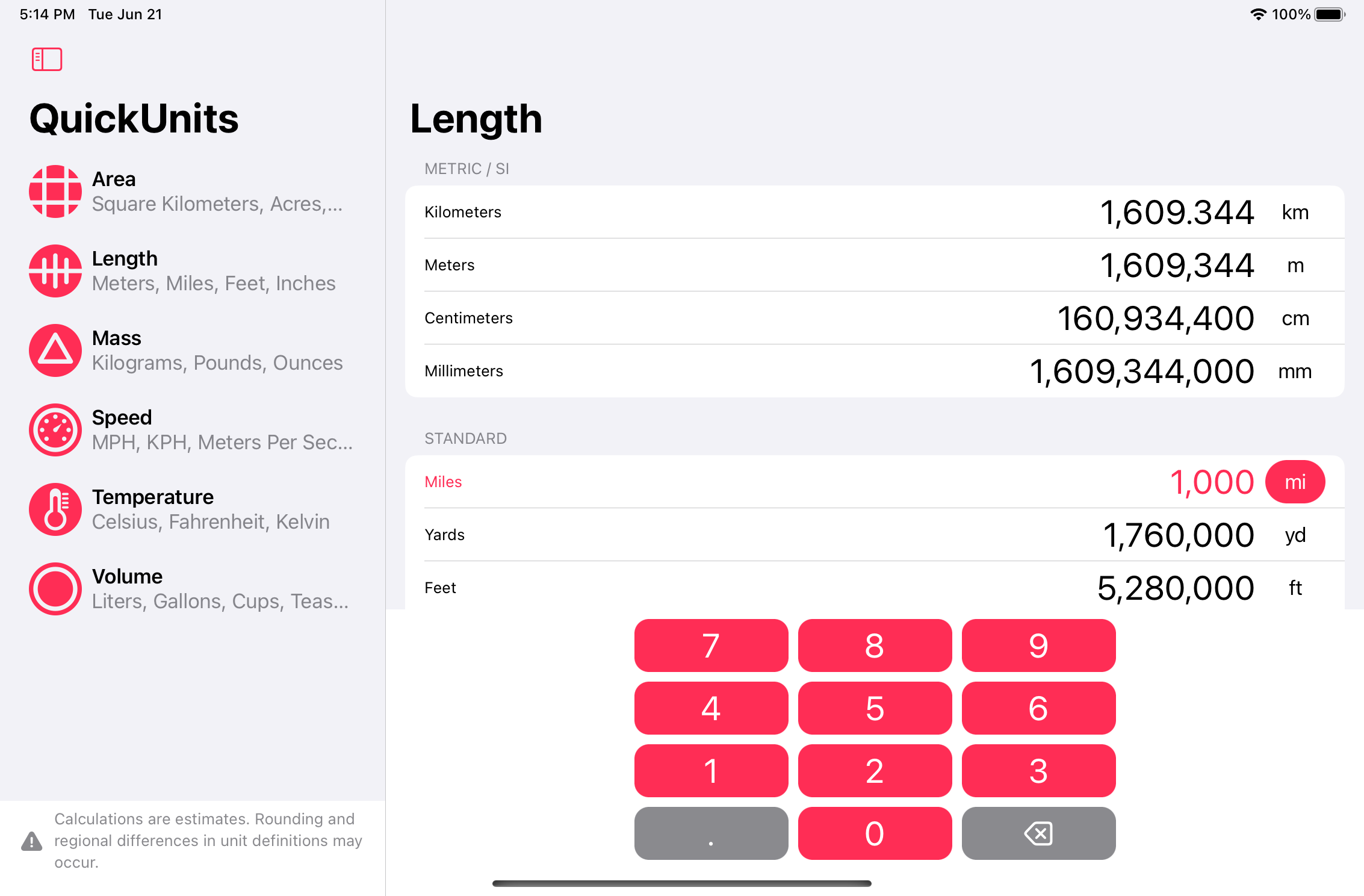
And finally, a sneak peek into the iPad design. With a larger screen there’s no need to swipe back to show the menu, it’s all on the screen all the time. I’m currently battling a bug or two with the iPadOS 16 beta, but I’m sure we’ll have it smoothed over soon enough.

That’s all for now. I’m planning to release the new version of the app when iOS/iPadOS 16 comes out in the fall and possibly for the Mac sometime after that. Stay tuned, I’ll post again when it’s live.

'Fundamentally Wrong'

WARNING: the linked articles contain extreme descriptions of violence.
John Gruber on Daring Fireball writing about the the Verge piece The Trauma Floor: The secret lives of Facebook moderators in America:

There is something fundamentally wrong with a platform that — while operating exactly as designed — requires thousands of employees to crush their own souls.

How did Google get so big?—60 Minutes

Daring Fireball linked to an excellent 60 Minutes report yesterday, covering how Google got so big, and the likelihood that there’s a lot of anti-competition going on there.
In addition to 60 Minutes’ excellent report, I’d like to point out that Google makes most of the products that people use to interact with the internet on a daily bases. Here are the ones I could think of off the top of my head.

  • Google Search: the most used search engine in the world.
  • Android: the operating system of choice for 80% of the world’s population. This gives access to phone calls, SMS texts, what apps and games are installed, and the location of everyone who uses it.
  • Chrome: the web browser that most people use most of the time.
  • YouTube: by far the biggest social video service.
  • Google Maps: the most used mapping service in the world.
  • Gmail: one of, if not the most used email system in the world.
  • Hangouts, Chat, etc: huge communications platforms. I’ve lost track of all the different apps they have like this.
  • Doubleclick & Adwords: probably the first and second biggest ad platforms in the world (besides maybe Facebook).
  • Adsense: a service for putting ads on web sites other than Google’s.
  • Google Analytics: the most used web traffic statistics and analysis framework.

Google has access to every endpoint on the internet and a whole lot more. I’ve been moving further and further from using their services and software for personal activity, but as a web developer, I can’t avoid it professionally. If I can make one recommendation, try DuckDuckGo for search. I use it for everything and am quite happy with it. DuckDuckGo famously don’t track people and their searches, and still manage to get great search results. With the recent breaches from Facebook and their Cambridge Analytica fiasco, I shouldn’t have to explain how our online activity and personal information can be used in nefarious ways.
Note: I don’t use Google Analytics (or any other analytics on my personal websites), but I am fully aware that the YouTube videos embedded on this site report back to Google. I try to avoid that kind of thing, but it’s nearly impossible right now.

The iPad I Want

There’s a lot to like in the iPad lineup right now. Since the announcements at WWDC and the announcement of the new 9.7 inch iPad last spring, there has hardly been anything but praise for the iPad. And for what it’s worth, I think that praise is well deserved. But there’s still a hole that I would like to see filled when it comes to iPad hardware, namely, the iPad mini.
While this article contains a lot of wishes from me, I also tried to be realistic with options and pricing. Let me know if you think I’ve gone off my rocker, but to me, I think this would be a great product. I’m also not trying to replace my MacBook Pro. Though some people are moving away from laptops in favor of iPads, as a web and software developer, I can’t conceivably do that yet. In the mean time I would like a product that’s small and easy to take with me in addition to my MacBook.
Before I get started on my feature by feature set, let me lay out for you what I like to do on iPads. I like to read (books, websites, email, documentation), draw, edit photos, watch videos, and occasionally play games. The iPad mini with its 7.9 inch screen is well suited for nearly all of those things, but it’s dreadfully out of date. It currently has an A8 SOC (system on a chip), 128 GB storage, 2 GB of RAM, and an sRGB, 60hz display (without modern anti-glare coatings).

Storage

The 128 GB of storage is enough for what I want to do on an iPad, but it’s big and bigger “Pro” siblings are now offered with up to 512 GB. They probably don’t need to go full “Pro” on the mini, but I wouldn’t mind seeing a 256 GB option. At least then I’d be able to download my whole photo library and edit to my heart’s content. But with iCloud photo library enabled, that’s not a deal breaker as it can download photos on demand from my library as long as I have an internet connection.

RAM

2 GB of RAM is probably enough for the iPad mini, but it won’t be in the future. While I don’t particularly care about split screen apps most of the time, as I tend to do one thing at a time on an iPad, it would be nice to use them on occasion. In it’s current form it can do an app slide over, but there are loading times when switching apps like that. So it doesn’t really help any more than just fully switching apps. The new multitasking features coming in iOS 11 only intensify the need for even more RAM. But a faster SOCs (system on a chip) might be enough to counter that problem since newer iPads with only 2 GB of RAM can do split screen. So I’d say this is also not a deal breaker.

System on a Chip

The iPad mini 4 has an A8 processor that is just plain slow at this point. For this reason alone, I wouldn’t recommend that anyone buy the current iPad mini. It was released two years ago and is terribly slow compared to the A10, or even the A9. At this point I’d like to see an A10 (or better), but even an A9 would be a welcome improvement. By Apple’s own measurements, an A9 has a 1.6x faster CPU and 1.8x faster GPU. The new iPad Pros, meanwhile, have A10X SOCs. Which boast far greater power. I wouldn’t expect an A10X in an iPad mini, but the A10 from the iPhone 7 would be wonderful boost while being a realistic option.

Geekbench Multicore CPU Benchmarks (higher is better)

  • iPad mini 4 (A8): 2810
  • 2017 9.7 inch iPad (A9): 4470
  • iPhone 7 (A10): 5523
  • 2017 iPad Pros (A10X): 9146

Display

The display is also an area the iPad mini falls short. The new iPad Pros have richer color with the Display P3 color gamut. The Display P3 color gamut shows about 25% more than sRGB. The Pros also have a much brighter displays and better anti-reflection. As I mentioned, reading is something I love to do on iPads. The iPad mini 4 is not a great option for cases when you’re reading in sunlight.
The iPad Pros also have a crazy fast 120hz refresh rate (part of the “ProMotion” feature set). I wouldn’t expect that to come to the iPad mini anytime soon though, since the only devices that currently use that refresh rate also use the A10X system on a chip. It would be nice for drawing since it greatly reduces the lag behind the Apple Pencil, but I wouldn’t expect it, and I don’t think this would be a deal breaker either.

Display Brightness (max)

  • iPad Mini 4: 450 nits
  • 2016, 2017 MacBook Pro: 500 nits
  • 2017 iPad Pro: 600 nits
  • iPhone 7: 625 nits
  • Apple Watch 2: 1000 nits

Input

Speaking of Apple Pencil. I desperately want to see the iPad mini gain Apple Pencil support. For the reasons I pointed out above, the experience wouldn’t be as good as it is on the brand new iPad Pros, but if it were as good as it was on the older iPad Pros, I would be quite happy with that. I don’t plan on building a carrier with my drawings, I just like to doodle, take notes, and edit photos. An iPad mini with Apple Pencil support would be great for that.
Anyone who knows the iPad line of products well is probably thinking that I’m about to say that the iPad mini should get the Smart Connector as well. I’m not. The Smart Connector is a specialized connection that has thus far only been available on iPad Pros and has only been used to connect keyboards (a very select few at that). I might be wrong but I don’t think there are a lot of people who want to use an external keyboard with an iPad mini. Those that do can still use bluetooth. It seems like a waste of space and money to try and jam a Smart Connector into an iPad mini.

Sound

The current iPad mini 4 has two speakers at the bottom of the device near the home button. When you hold it in landscape orientation, all the sound comes out of either the left or right side depending which way it was rotated. The iPad Pros have 4 speakers and know which way you’re holding it, so it can rotate which speakers play the left and right channels just like it rotates the display. I wouldn’t expect the iPad mini to have as good of speakers as the iPad Pros since it likely doesn’t have room for the Pro’s inner chambers that help with bass. But just putting a small speaker on each corner would certainly make it sound a lot better, particularly while watching videos or playing games in landscape orientation.
The iPhone 7 and 7 Plus also got an audio boost compared to their predecessors. The upper speaker on the iPhone 7 is now a loudspeaker just like the bottom one. Not only are they much louder now, they also do a similar effect as the iPad Pros when their rotated 90 degrees, allowing the top and bottom speakers to become left and right channels.

Differentiation

With the addition of Display P3, more RAM, a faster SOC, bigger storage sizes, and Apple Pencil support; some people might think the iPad mini would become an iPad Pro. But there are few key things that would still differentiate it from its bigger siblings. As I already mentioned, I wouldn’t expect the 120hz refresh rate to come to the mini, it will stay at 60hz, and I’m fine with that. In addition, the bigger iPads feature the Smart Connector for keyboards; the “X” line of SOCs (featuring more and faster CPU and GPU cores); as well as screens big enough for professional graphics and video production. I also wouldn’t expect the iPad mini’s cameras to be at the same level as the Pros. It could keep the same cameras it already has for all I care. I’m happy to pull out my phone out (or a bigger camera) when I need higher quality photos.
There’s also the question of the new 9.7 inch iPad that came out last spring. It starts at an amazing $329 and is a great deal. With an updated iPad mini there would be quite a bit over overlap in features with both the Pros and the 9.7 inch iPad. But I for one would be fine with paying more for a specced out mini than a budget 9.7 inch iPad.

The Final Product (one can hope)

iPad Mini 4 iPad Mini 5
A8 SOC A10 SOC
128 GB storage 64, 256 GB storage options
2 GB RAM 2-4 GB RAM (more the better)
sRGB display True Tone Display with P3 color
2 speaker audio 4 speaker audio
Apple Pencil Support
$399 USD (128 GB) $399-499 (64 GB), $499-$599 (256 GB)
  • LTE would remain the same $129 USD option, just like it’s always been.

QuickUnits – An iOS Unit Converter

Two weeks ago today, Apple approved and posted my first foray into app development in the form of QuickUnits. I had the idea for this app last summer and worked on it sporadically since then. Leading up to the launch I put a lot more time into it. It seemed that the closer I got the more motivated I became. I have to say, I haven’t had this much fun “working” in a very long time. I can’t wait to start on the next project, which is currently in the planning phase.
Check out the QuickUnits website or in the iTunes app store.

Accessibility and Dyslexia

Marco Arment, the creator of Instapaper, posted an update to his beloved iOS app today. In the notes he listed a new feature that instantly grabbed my attention and gave me one of the first, “Ah ha,” moments I have had in a very long time. The feature was listed as follows:

New Open-Dyslexic font to increase legibility for readers with dyslexia.

Upon reading that line I realized something, in my six years of creating websites I have tried to think of every accessibility issue I could imagine and account for it. Most issues, such as having large enough fonts for people hard-of-sight and mixing tones in addition to color in order to account for colorblind-ness, come second nature to me now. But, I have never once thought (I am ashamed to admit) that dyslexia was something I could help with. I always thought dyslexia was something that fell into the abyss of, “I can’t do anything about it.” Happily, thanks to Mr. Arment, I now know I can do something about it.

Helpful Links

Paper for iPad by FiftyThree

Amazing apps like this are the reason I want an iPad. I think it’s about time.

I should mention, it’s a free app with paid upgrades. Grab yourself an iPad and get drawing on Paper. More info on their website.

Macfusion for Quick Web Updates

Macfusion is an app for OS X (obviously) that allows you to mount FTP and SSH connections as though they were drives on your Mac. Though not a heavy use tool, Macfusion is quite nice for making quick and dirty updates to websites. When “mounted” all the files on your web server act as though they are on your computer, which means you can directly edit them. Just make sure you download a backup first, because that is a very quick way to screw up a website.
Did I mention it’s free?
I hear there are some problems with Lion, but if you follow the trail on the Macfusion Github page it will work just fine. They recommend downloading and installing the only dependency, MacFUSE from this site, rather than the copy from Google.
As a side note, FTP seemed quite sluggish for me, to the point where it was nearly unusable, but when connected with SSH it’s quite speedy,

960 Grid System 12 column Cheat Sheet

I decided it was time to learn the 960 Grid System for coding web sites. And what better way to learn than to make my own cheat sheet. Let me know if you find this useful and maybe I’ll make a 16 column cheat sheet as well.
960 Grid System – 12 Column Quick Reference